where to cut is one of the hardest decisions. i am guilty of defaulting to cut through greenland more than any other country when making world map desktop wallpapers.
I don’t think it’s that difficult to decide. There’s a lot more room between San Jose, California and Hokkaido, Japan than between Natal, Brazil and Dakar, Senegal; cutting through the Pacific makes the most sense for most applications, I think. Sure, the Bering Strait is pretty tiny, but if you break in the Atlantic you’re going to get a lot of distortion in Greenland (hasn’t it had enough?), mainland Europe, and Brazil.


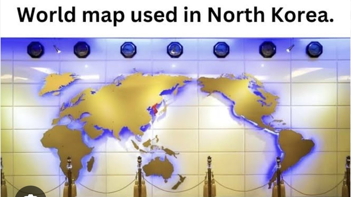
It makes as much sense as any other 2D projection of the globe.
I like this one
In this map’s defense, it really highlights the value of a northwest passage and all the canals.
Maybe a little more than this one…
thank god I needed a map with an inverse relationship with population and size on the map
Doesn’t the US sometimes use one that puts America in the center and cuts Eurasia in half? Can we agree this one is definitely stupid?
This unlocked some memories, wow.
I’ve never seen that in the US. That is extremely stupid. Typically maps in the US center around the Atlantic/Europe.
From the US: I grew up with a map like this in the dining room. It was super confusing as s a little kid.
where to cut is one of the hardest decisions. i am guilty of defaulting to cut through greenland more than any other country when making world map desktop wallpapers.
I don’t think it’s that difficult to decide. There’s a lot more room between San Jose, California and Hokkaido, Japan than between Natal, Brazil and Dakar, Senegal; cutting through the Pacific makes the most sense for most applications, I think. Sure, the Bering Strait is pretty tiny, but if you break in the Atlantic you’re going to get a lot of distortion in Greenland (hasn’t it had enough?), mainland Europe, and Brazil.