Hi, firstly thank you to all the beta testers that have helped find bugs and issues. I hope this release is even more stable as a result. It’s been a couple days since the last release so I was able to get a lot done in this one. Big changes include a bottom navigation drawer, comment navigation, and improvements to the settings page.
What’s new
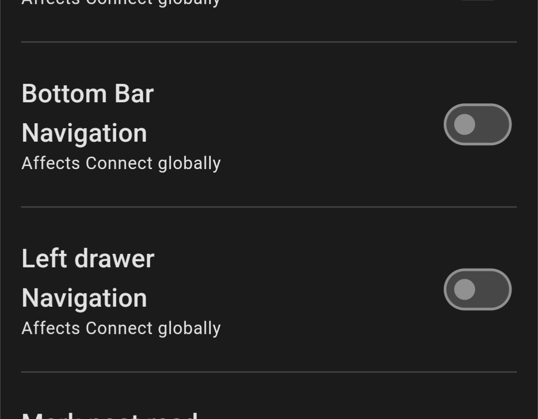
- Optional bottom navigation drawer
- Comment ‘next’ 'prev navigation bar
- Left hand/ right hand mode which squishes comment actions to the left or right.
- Setting to mark post as read when viewing image
- Added setting for changing the theme text colour
- Community label is displayed in the profile list of posts
- Ability to mark posts as read when viewing images
- Ability to fix the top bar
- Added sort option for Top ‘1 hour’
- Clicking links now first confirms with the user
Fixes
- Memory optimizations to make scrolling smoother
- After adding reply, no longer switch to single thread view
- Fixed issue with reply button
- Display message when all posts in a list are being filtered
- Fixed issue with editing replies with special characters
- Improved comment navigator to scroll to a more centered position
- Added a post image to the settings post edit page
- Fixed issue with preload option not saving
- Bell notification icon should update a bit more smartly
Links:
-kuroneko
Amazing work, thank you. One piece of feedback: I would really love it if the top navigation would be visible after a bit of scrolling up, not after scrolling all the way up to the top (if that makes sense?).
RiF did that, after scrolling about half a page up, the top navigation came to view already, making it easier to navigate between top, best, saved, etc, and to access your settings and profile.
Would that be possible?
It already works like that, but you have to stop scrolling up, if you keep scrolling it will never show until you reach the top
Enable the “Sticky Top Bar” option under settings.
Thank you! Foind it, testing it already. Sadly not entirely sticky, but it does appear after a little while, which is better than without the setting!
Yes please!
To build off your comment. I would like to see the post topic in the top bar when browsing the comments, I sometimes forget what was the topic when I’m looking at comments (most of the time when I come back to it later). It would be nice not having to scroll all the way to the top. I hope that makes sense.
Also, a refresh button that’s not in the sub menu.
Real talk: this app is great, and you’ve clearly poured like a month into it non-stop. Do you have a job? Is this your job right now? What’s the financial plan for the app, or are you just winging it? ;)
I have a job in a related field, this is just for fun and I think having nice native apps will help Lemmy succeed as a platform.
You’re awesome! If you’re in Winnipeg, I’d buy you a beer :)
I noticed a buymeacoffee link in settings last week. Goto settings and scroll all the way down for the following URL
thank you
Looking good…
Also, in case anyone else was worried about it like me, I took one for the team and disabled both left & bottom drawers. Luckily, it adds a Setting icon to the top bar.

I would still argue that these options should probably be a toggle between left & bottom, though, since you still do lose links to stuff like your Profile, Inbox, and your subbed /c’s

Extremely minor visual error when viewing a post…
It shows the post’s instance as being on OP’s home instance, rather than the /c’s instance.

Great work on the app! It’s made the transition from reddit much smoother than the other apps I tried!
Question: Is there a way to disable the confirmation before opening links? It’s a bit tedious to click on a link and then be asked “Are you sure?” every time.
Hey thanks for the feedback! Yeah good idea I’ll see what I can do
Working great! Thanks for the hard work!
Thanks for your amazing work 🙏
I absolutely love the bottom bar
Seeing an issue that just started this morning, Connect launches to the splash screen but hangs. Neither force quitting the app nor rebooting the phone helps. App was working great yesterday.
My instance is fmhy, its web interface seems to be up and running normally. Suggestions? Thanks!
Is that on the 1.0.89 beta? I’ll take a look!
No, I am not on the beta, it’s v88
It’s very odd, it’s been rock solid up till this morning. I think I got an android update last night that might coincide with the issue - android 13 July 5 update.
I find the Comment Navigator confusing and non intuitive. Plus it moves the comment and buttons upon clicking a comment to up/downvote.
Except from that Connect is stellar!
Unfortunately neither comment navigation nor marking post read on image view seem to work for me. I’ve tried turning them off and on a few times and I’ve restarted the app.
After a quick test, it looks like viewing an image marks the post as read, but the post doesn’t visually update until you refresh. It would be nice if the post got visually updated without having to do a full refresh.
One of the best lemmy apps currently
I’ve been loving the app so far. I really appreciate the horizontal swiping feature. just wish swiping to the left doesn’t exit me out of the post.
Just disable “Enable swipe navigation”
Oh hey you added in the comment stuff! It’s great for an initial release, though it definitely does need some refinement to be easily useable.
- Comment feature buttons
- They mostly work well, and look great! But tapping a comment does push the entire comment down as the buttons on top appear. Versus the ideal behavior of the comment position remaining absolute, and the buttons appear relative to it
- Also, on narrow screens, the Next button does get pushed off a little bit
- Done
- Functions as expected, hides the extra buttons from the active comment
- Hide
- Correctly hides the comment when tapped
- Show
- This shouldn’t need to exist, as tapping on a hidden comment should automatically show it
- Prev
- Correctly activates the previous top comment, and shows the selected comment features. UI moves the selected comment just off-screen, so you have to scroll down some more to see it, even if it was already on-screen
- Next
- Same issues as the Prev button, comment selection is correct, but off-screen
- Comment feature buttons
Nice! The only thing holding me is the janky scrolling really hope that could be fixed.
Still crashing on occasion for me as well. However it is vastly improved.
Currently on Beta 89. Liking the restyle on posts. But I think the targets on the upvote / downvote buttons need to be about 200% bigger. Spent way too much time trying (and failing) to upvote a post this morning.

Will be in the next beta release! Hopefully later today.
Much better. Though I’d even say the target could be bigger yet.
About one-third of the time, I still miss, which just opens the post.


