Keep It Simple. The flag should be so simple that a child can draw it from memory.
I drew it quickly in Paint with a trackpad, so that’s probably average to below average kid art ability. I think it just barely meets this recommendation.
Use Meaningful Symbolism. The flag’s images, colors, or patterns should relate to what it symbolizes.
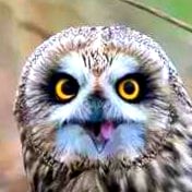
Colors symbolize the Great Lakes region. Owls symbolize wisdom or watching over the land. Both of those seem flag-worthy.
Use 2 or 3 Basic Colors. Limit the number of colors on the flag to three which contrast well and come from the standard color set.
The colors aren’t exactly what I’d expect to get in a random pack of pens, colored pencils, or crayons, but they aren’t too far off. They aren’t crazy colors, I’m bad with colors, and I still see a distinct purply color, pink, and pale blue. I feel a light touch with colored pencil or crayon could approximate these colors well enough for people to recognize it.
No Lettering or Seals. Never use writing of any kind or an organization’s seal.
No letters, the owl/tree could probably be called a seal if one wanted to make that arguement, but I’d compare it more to a sigil from a flag from the age of heraldry instead of a more modern state seal. I think this is still simple enough for someone to approximate fairly well. The tree is just squiggles, and a circle with a vaguely tear dropped shape makes the owl in minimalist fashion.
Be Distinctive or Be Related. Avoid duplicating other flags, but use similarities to show connections.
The tri-color field is very typical flag style. The owl and tree and the color choices make it distinct. I think we are good here.
Of course there are exceptions to every rule, but depart from these five principles only with caution and purpose.
So if you needed to make this into an owl flag for your needs, this wouldn’t be the worst starting point. Finding a satisfactory way to simplify the owl while maintaining its distinction as an owl is the hardest part. Otherwise, we’re already probably better off than at least 50% of modern flags!
Let’s check to see how it does with the 5 guiding principles of vexillology!
I drew it quickly in Paint with a trackpad, so that’s probably average to below average kid art ability. I think it just barely meets this recommendation.
Colors symbolize the Great Lakes region. Owls symbolize wisdom or watching over the land. Both of those seem flag-worthy.
The colors aren’t exactly what I’d expect to get in a random pack of pens, colored pencils, or crayons, but they aren’t too far off. They aren’t crazy colors, I’m bad with colors, and I still see a distinct purply color, pink, and pale blue. I feel a light touch with colored pencil or crayon could approximate these colors well enough for people to recognize it.
No letters, the owl/tree could probably be called a seal if one wanted to make that arguement, but I’d compare it more to a sigil from a flag from the age of heraldry instead of a more modern state seal. I think this is still simple enough for someone to approximate fairly well. The tree is just squiggles, and a circle with a vaguely tear dropped shape makes the owl in minimalist fashion.
The tri-color field is very typical flag style. The owl and tree and the color choices make it distinct. I think we are good here.
So if you needed to make this into an owl flag for your needs, this wouldn’t be the worst starting point. Finding a satisfactory way to simplify the owl while maintaining its distinction as an owl is the hardest part. Otherwise, we’re already probably better off than at least 50% of modern flags!