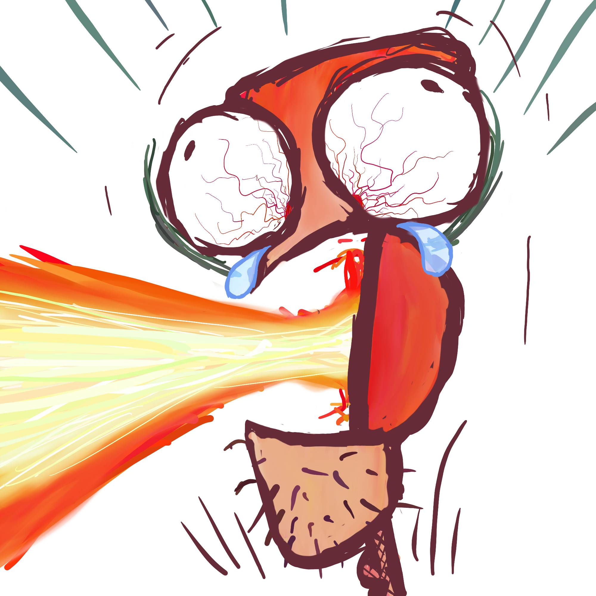

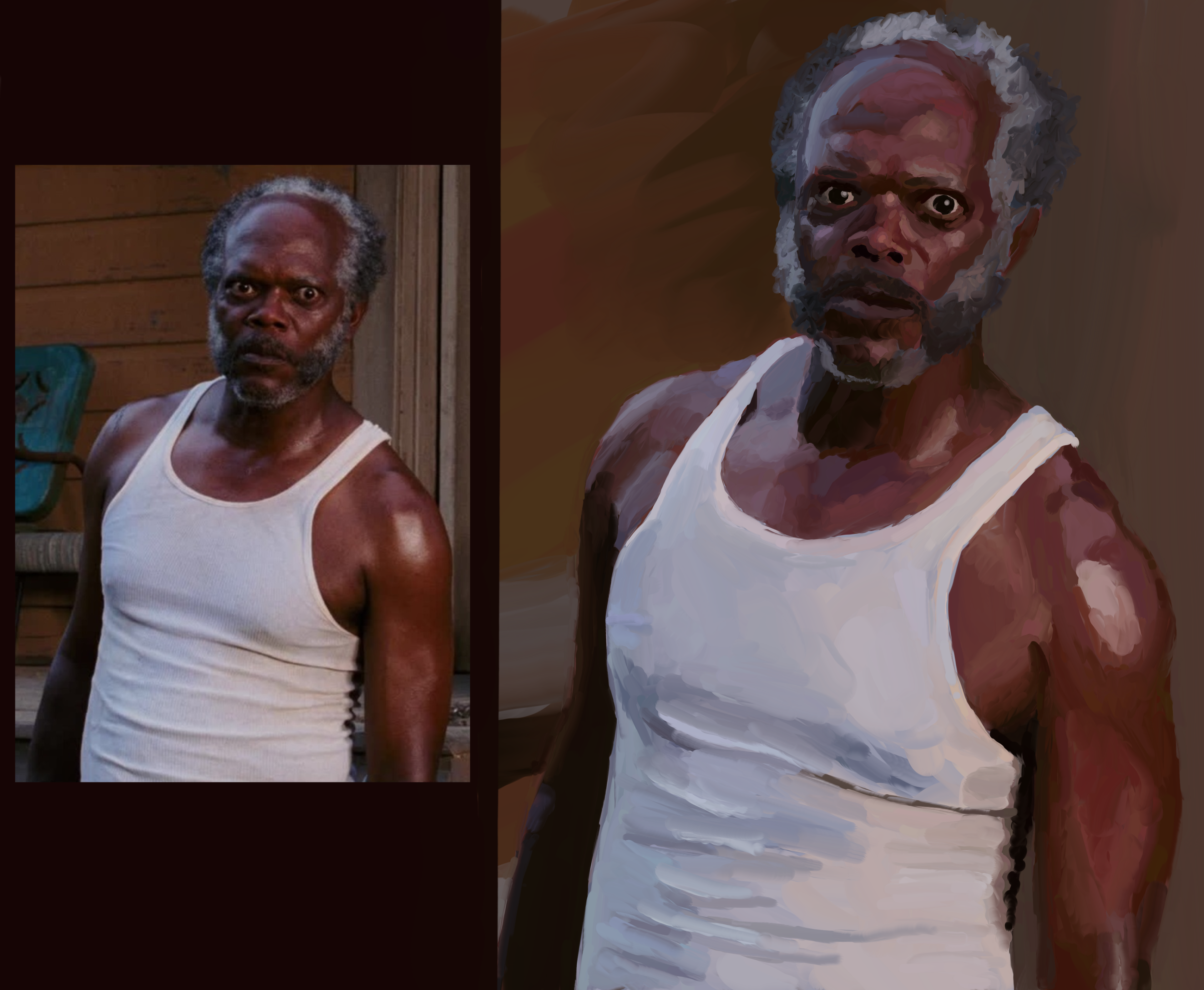
After Jules eating a tasty burger I was feeling confident enough to take on The Stare. It’s my best painting yet but the expression isn’t quite right, it’s lacking intensity of the original and I’m not sure what I’m missing. Feedback?
I’m doing one more SLJ in this series, it’s time for Mace Windu. That’ll make 16 and then I’m in to paint some family members. Not sure I’ll share them here, privacy and all. But this series has me confident enough to try, I’ve learned so so much! Thank you for all the feedback, critiques, and advice!
You must log in or register to comment.
deleted by creator
🤣🤣🤣
I think it’s in the eyebrows
Looks fantastic though!
Oh yeah, particularly his right one. Damn, nice catch!
Honestly I think you nailed it. I loved the burger one too. You could make some money on these
Thank you! And maybe I can con my wife out of some money for em 🤣
I’ve caught most of these, and the massive leaps of improvement are genuinely impressive. Not only in how recognizable he is, but in your general style over the series. I think you’ve nailed SLJ more than a few times now.
Psyched to see Mace!
Thank you, that’s so kind!
And I’m intimidated by the reference picture of Mace. It’ll be the hardest yet… Gotta step up my game…!?
hey where is the painting - I can only see 2 identical images, just 1 is bigger /s
🤣🤣🤣
Thank you!
It has the vibe, nice work.
I think it’s a tiiiny bit less intense than the original because his face looks fuller. Maybe going a shade darker in the facial shadows would make him more gaunt so the expression really pops.
I see what you mean, thank you!
You have the look with the eye on the right. The eye of the left holds a more muted expression. Someone else pointed out some of the facial shadows would help, and I agree. Higher contrast around the eyes at least will help convey ‘The Stare’.
Nice work.
Great advice, thank you!!
Your forms, lighting, colours, and values are all technically quite strong, but I see what you mean about not conveying as much emotional intensity.
It might be a limitation of the style itself? The way colour and light are used here make the eye want to appreciate the play of sunlight across foliage rather than connect with Sam’s baleful gaze.
It’d be interesting to see if you could achieve the emotionality of the original with either increased realism or perhaps less, to emphasize the feelings on display. Or you might try a more surreal composition to give it some Edvard Munch energy. That’d be a fun angle.
I want to emphasize that you really have a great piece of work here, and it’s hard to be very critical when the technical achievements of the work are so strong. Thanks for sharing.
Edit to add: or you could just try emphasizing the tension in the eyes and mouth, just pushing them a little bit past what is shown in the reference photo to make them more legible in this style.
Oh wow, all great ideas. I do feel like to push myself as an artist I will need to go beyond what is right in front of me. Thinking about it is intimidating and I’m not really sure where to start. But I will absolutely save your comments and reference them when I’m ready to give it a go!
In terms of digital painting, you’ve already far surpassed what I can do and I would love to see how much further you can take it. It can be intimidating to push yourself, but I for one would be delighted to see that happen.
Me too! It’s nice having adult kids and discretionary time to get back into things I gave up when I started having kids.
Yep I’d go with the mouth tension, it’s too relaxed
I recommend watching Clint Eastwood movie, there’s one with a scene with a close up that feels like it’s a whole minute of just his intense stare and some subtle mouth movements. Obviously he kills half the bar in 10 seconds after the scene.
Can’t remember the name of the movie, it’s where he’s avenging Morgan Freeman (?) getting killed.
By the way, great job mutha fucka Ball Man
Excellent work
Thank you!
There’s some very slight differences in the eyes. You painted them a little bit wider / more open, which shows fear mixed with anger rather than pure anger and annoyance. The photo has his pupils a bit more dilated but with smaller highlights, exaggerating the dilation effect a bit more.
Overall fantastic work though! I really like this one!
Oh good catch! Thank you!!
I agree with poster above. I also think his shoulders are a little more straight on in yours which makes him slightly more open.
Oh wow, I didn’t even notice. Thank you!
I thought you were doing a Samuel Jackson Disco Elysium portrait for a second.
🤣
One of my favorite movies and scene. You did really good, indeed! Agree with the other commenter about the eyebrow.
Thank you!!
Man, that’s really impressive
Fantastic work!
I think if there’s anything different responsible for the intensity, its in the brow. But frankly I think you definitely got a whole lot of intensity in your version
Thank you!!
I’m not sure how to give constructive criticism, especially since I don’t paint at all. But I’d like to point out that your first couple of SLJ paintings looked more like Eddie Murphy to me. And this one… Kinda looks like Donald Faison. I also may have a mild case of face blindness.
Or you’re better at picking up nuance than the rest of us! Thank you!!
I hope you are hanging these all over your home, or maybe just one SLJ room. Good job!
Thank you! I’m planning to stitch all 16 together in a simple 4*4 grid, print, and frame to hang somewhere.

