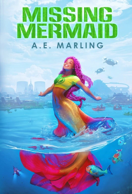
I’m swimming-with-mermaids delighted to reveal the cover of my next solarpunk mystery novel, Missing Mermaid. Right now I’m deciding how best to arrange the text on the cover. Do you recommend option one (author name on her tail) or option two (author name and title both up in the sky)?
The illustration is by Nell Fallcard. You can order the ebook, internationally, on the indie site Smashwords after its release on May 24th. You can preorder the book on Amazon. The paperback will come later on Barnes and Noble.


I like option 2, I thought I would prefer Option 1 before I saw 2 but it’s executed really well in 2! Also, that illustration is gorgeous, and thank you for sharing the illustrator’s details. I want my next novel to be solarpunk, and I am definitely in the market for a new cover artist…
I need to add this and Murder in the Tool Library to my storygraph. And preorder/buy a copy of both tbh.
I wish you the best with your own solarpunk writing. Be careful when hiring an illustrator. I’ve had some issues avoiding AI art.
Hope you enjoy Murder in the Tool Library. Wishing you greener futures.