

Drop the dead donkey lion!
I don’t like the new design, and I like the old Victorian design.
Helen Edwards, adjunct associate professor of marketing at London Business School, said the rebrand would help to reduce the risk of excluding potential buyers.“The story of it coming from religious belief could put the brand in an exclusionary space, especially if it was to go viral on X or TikTok,” she told the BBC.
When I’m shopping, I definitely look closely at the quote on the can, then look it up, and decide not to buy syrup because it turns out to be a bible verse…
This is the best summary I could come up with:
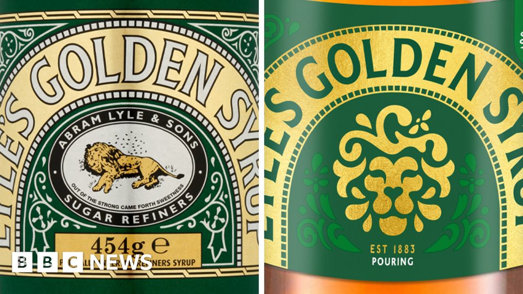
The image of a dead lion being swarmed by bees is to be dropped from some of Lyle’s Golden Syrup packaging.
A rebranded image of a lion’s head with a single bee will feature on products, including the firm’s plastic syrup and dessert bottles.
But the classic Lyle’s Golden Syrup tin will be excluded from the rebrand, keeping its more than 150-year-old packaging design.
According to the company’s website, Lyle had strong religious views, which is why the logo depicts the story of Samson from the Old Testament, in which Samson killed an attacking lion, and later noticed a swarm of bees had formed a comb of honey in the carcass.
Helen Edwards, adjunct associate professor of marketing at London Business School, said the rebrand would help to reduce the risk of excluding potential buyers.
“The story of it coming from religious belief could put the brand in an exclusionary space, especially if it was to go viral on X or TikTok,” she told the BBC.
The original article contains 419 words, the summary contains 166 words. Saved 60%. I’m a bot and I’m open source!